 Dyno
DynoSee what’s working.
Revenue, members and attendance over any period, with trends, a booking heatmap and the names behind every number, so you can run your club by the numbers.
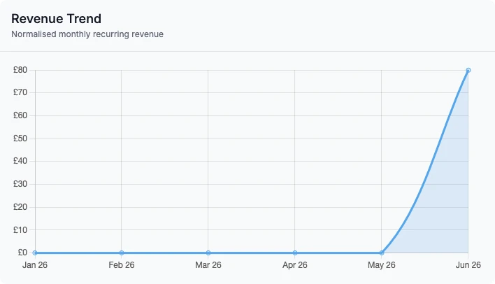
The numbers that matter, up front.
Trends, direction and busy times on one Analytics page, on every plan.
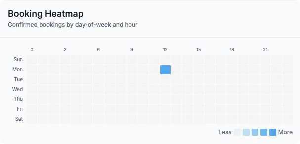

Bookings by day of the week and hour of the class, so you can plan the timetable and staff around real demand.
What’s on the page.
The Analytics page is on every plan. Pick a month, three months, six months or a year, and every figure and chart follows.
Money
Monthly recurring revenue and average revenue per member, worked out from the memberships members hold, with yearly and weekly plans turned into a monthly figure. A revenue trend chart and revenue by membership tier show where it comes from. If payments have failed, a banner at the top shows how many and what they’re worth each month.
Members
Active members, new members and cancellations for the period, and a membership growth chart. Members who haven’t booked anything in 30 days or more are counted as at risk. Open the new members, cancellations or at-risk card and you see the people behind the number, up to 100 at a time, ready to call or message.
Attendance
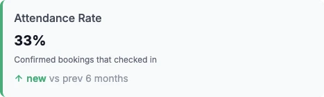
Attendance rate, average class fill and no-show rate, with bookings set against attendance on one chart. The top five classes by fill show what’s working, and the booking heatmap shows bookings by the day and hour each class starts, so a quiet Tuesday slot stands out.
Which way it’s heading
New members, cancellations, at-risk members, revenue recovered and the attendance figures each show their change on the period before, as a percentage with a coloured strip. Where there was nothing the period before, the card says new rather than inventing a percentage.
Revenue recovered
One card counts the money that came back: failed payments that were later paid, and, with the Retention bolt-on, members who booked again within 30 days of a we-miss-you message, counted at the value of their membership.
Your home dashboard
Every club gets a home dashboard with member counts, the booking trend, membership by tier, the day’s schedule, who is checked in and recent cancellations. On Pro, or with the advanced analytics bolt-on, you can rearrange it: drag panels into the order you want, resize them, remove the ones you don’t use and add trend cards and charts from a tray. Each person on your team keeps their own layout.
Getting the data out
Members, events, bookings and transactions download as spreadsheets from the dashboard on every plan, for your owner, admins and managers. Transaction exports cover up to the last 12 months and include each payment’s fees and the amount that reached your account.
What it doesn’t do
There’s no report builder, and the longest period is a year. The heatmap counts bookings rather than check-ins. Members never see any of it: analytics is for your team only.
Questions clubs ask.
Get your club running on Dyno
30 days of Pro free, no credit card. Most clubs are taking payments the same day they sign up, with dashboard & analytics and everything else included.